When given a client who has a lot of work that needs to be done.. and as the work progresses, other ideas form, older ideas lose priority, etc – how does one show progress?
The specific statement that spurred this was “You guys were supposed to be done N time ago”. True, for the scope from N-1, the date agreed to was N. How can I show you how things have changed since then? How can we agree on when things will actually get done?
A Solution: Add Months to the Burndown
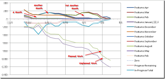
What I started to do is keep track of work by when it was introduced into the queue. Each month got its own mini-burndown. In the picture above, pay attention to the spaces between the lines, not the lines themselves.
I like that this graph shows:
- That work is being done! You can see work getting nibbled away from the top, showing up at the bottom.
- That I can calculate a velocity (slope of the green line) — in fact, i can calculate a “slowest” and a “fastest” velocity. Reality was somewhere in the middle.
An additional thing was to somehow show time taken by production issues – unplanned, un-estimated things. Overall, quite slight – less than 10% of the project?
Improvements
- I tried to show work in progress on this graph; it was not useful. I would not do that again; it would be better to have a mini graph showing ins and outs of things entering and leaving development. If that was even needed.
- I would probably put unplanned stuff not-stacked, so that changes in it could be seen easier.
- If there was some way i could have the month retain its color on the “done” side, that would be awesome. Then we would also be able to see “estimate vs actual” (the bottom part is all based on time reported, whereas the top stuff was based on estimates).
Before I let this post, I need to show it to the client to ensure that I’m not divulging too much information.


