Switching from iPhone to Android (Samsung S7)

img_20170903_110354_847I wanted to write a nice detailed blog post with pictures and screenshots. Would take too long to get it “Perfect” so I am punting.  (I did write this using the WordPress app on the phone)  ** I continued this from my laptop later.

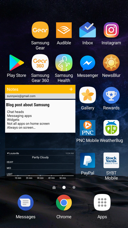
Here are crib notes instead.

Summary: it’s good, it’s functional. It’s less pretty on the watch side, and MMS is subpar, but better voice recognition, LastPass integration, wireless charging make up for that. I’m going to stick with it for a year.

Addendum: it’s frustrating to learn a new ecosystem. And because Android has so many variations it’s hard to know what information applies. For example – getting that screenshot in this post – there is probably a better way but I had to use Google voice to take it, send it to WordPress media library, then include it in this post.   (Addendum to the dum:  Turns out there’s a “swipe left with your palm” gesture for my phone, but I still can’t save the screenshot to my camera roll)

Stuff I like:

  • Chat heads – if I use FB messenger for SMS.  They pop open over any app, and let me continue a conversation without switching apps.
  • Voice recognition is better – especially in the car.  It seems to want to use the phone’s microphone, rather than the 3 second delay switching to bluetooth through the car microphone.
  • Can choose default apps – like which Messenger app to use.    Thank you “Intentions”.
  • Widgets – Not going crazy with this, I only have two or three.
  • Not all apps on home screen – I can leave some in the drawer.  I don’t have to force myself to choose a position for EVERY FRICKING APP, just the ones that matter.
  • Always on screen – specific to my Samsung S7 device?   Shows time, date, next calendar appointment, etc before I hit the power button.   Major phone use case.
  • Number row – by default, turned on, on the keyboard.  Also a swipe keyboard, very nice for one hand use.
  • Better large screen shrinking – for single hand use.  Much more usable than Apple’s double-finger-home-button thing that never worked for me.
  • Last pass for apps – incredibly useful, when I’m in an App, Lastpass can integrate in and provide passwords.
  • Wireless charging – Coworker Steve gave me his old wireless charger.  I’m hooked.  No plugging in.  I bought one for the car, and I need to buy one for home.
  • Workout app has better sharing options – Pretty pictures, square format, straight to instagram, YES.
  • S2 watch can control which notifications go to watch and which dont.
  • Way more watch faces – This is also a curse.  I could not find a decent watch face which had battery, calendar, date, time, and actually worked across my multiple calendars.
  • I can put any icon anywhere on the page – I don’t have to plan from the top.   Thank God.  Clusters are easier to cluster.

What I miss:

  • Miss pretty emoji – I’m used to the iPhone and Slack emoji sets.  I don’t know for sure when I send my wife a kiss-with-eyes-closed emoji that its showing up the same.
  • Hue / OK Google integration misses things – I’ll say turn the lights off, and it will say “I got 18 of them, three not responding”, but only 8 will change.
  • Miss overcast podcast player with it’s auto silence trimming – For this reason alone, I have my de-SIM’ed iPhone living in the car, being an iPod for playing podcasts.
  • Group messaging wierdness interacting with iMessage – I won’t get pictures or video.  My entire family is iOS based, so I’m at a disadvantage.
  • Miss sharing position easily (find my friends) – Wife and I used to use this in passive always-on mode.  i can do Glympse for limited engagements.  I think Google has a solution for this somewhere.
  • Text selection wierd no magnifying glass for fine control – it took me a while, but I finally (with writing this post) got a handle on the text select stuff.  I have to take this back – I prefer the Android one.  I can actually drag the little draggers around, and they snap intelligently.   But I do miss the magnifying glass.
  • Miss square Apple Watch – It was smaller, looked better, and seemed more functional – especially the voice command part.
  • Miss scroll to top.
  • S2 battery life not great.   However, if I turn on Airplane mode (the S2 has its own 3G connection that I haven’t activated), its very comparable – down to 50% at the end of the day.

Btw, the screenshot is my second screen, not my home screen.


Nexus 10 vs iPad Retina: Actual Usage

I’ve had the pleasure (and displeasure) of using both an iPad Retina and a Nexus 10 for the last week or two last month and a half.  (this post was started in the last week of December)

This year, the iPad wins.

Nexus Failures:

  • In Facebook, a link to a video sent me to a mobile facebook website; the Nexus crashed and rebooted.   This has happened almost nightly.
  • In Facebook, pictures crop too much.   I couldn’t see the meme text without clicking in to the photograph.
  • In Evernote, linked to a Bluetooth keyboard, trying to organize the list of stuff that I want to get done for the weekend: a total disaster.
    • I could NOT use the arrow keys to navigate through the document.
    • Copy and Paste did not seem to work.
  • In the Trulia app: browsing real estate with the wife… Pictures much larger and UI worked better on the iPad.  I was jealous that she was using the iPad and I was using the Nexus.
  • Schlock Mercenary on was unusable – the UI elements fused together overlapping in a horrible way.
  • Battery on the Nexus seemed to drain faster… Two days to empty instead of four.  Note: This is not a measured, scientific observation.
  • Watching Videos on YouTube:
    • If the video started rebuffering, I could not tell the video to pause for a while (to let it get ahead).  I could only pause when it was buffered and playing.    On the iPad, pausing was independent of rebuffering.
    • I experienced rebuffering when their appears to be data still available in the buffer.
  • Netflix:  About the same, till I went to make a 30-second rewind (to show my wife something awesome).  On the Nexus, it did not register the shuttle change unless I did it for more than a minute.  When you’re trying to show a skeptical loved one something awesome, a minute is a LONG time to wait.  On the iPad, the shuttle resolution was better.

Nexus Successes:

  • Watching YouTube videos was a better experience – mostly due to the form factor, and better contrast.   (I was watching video on both devices – letting one “buffer” up while I watched on the other)

About the same:

  • Kindle Book Reading about the same on both.
    • Visiting a website with Flash – without working around it on the nexus – failed equally on both.  I tried working around it on the Nexus, but I couldn’t get that to work (probably the wrong browser)
  • Reading email via the Gmail app was about the same on both.  Both of them, I wish they fit more data on the screen. 

I dearly wanted the experience to be equal.. I have a soft spot for Android, I love its “intent” system for hooking apps together.. but as an honest consumer, the iPad experience for me in December 2012, January 2013, was better.   And for $100 more.. yes, I’d say it was worth it.

Addendum 2/9/2013:  My wife took over the Nexus for a while.    She is frustrated with it, HOWEVER, having multiple users on the device was clearly a win.     She’s going to get an iPad Mini, it fits her collection of purses better.  (Women are weird) (I like them like that)

Car Stats: Boogers! Foiled!

Minor setbacks in my Car Stats Gathering Solution.

Firstly, the repeated exposure to the really cold temperatures in the car, seems to have done something to my Droid battery.  It no longer charges when hooked up to the “normal” chargers; I had to hook it up to a 2.1A ipad-level USB port to get it to charge.  Rut-roh.  (Luckily my brother in law has given me his extra batteries from when he had a Droid, so I might have a spare.. but I may not be able to leave it in the car during the winter.  Data logging might be over for the time being).

Secondly, I found out I’m uploading the wrong folder. [Maybe].  

  • I was uploading /mnt/sdcard/.torque/tripLogs/<timestampfoldername>/<stuff>
  • The log that it generates is actually /mnt/sdcard/torqueLogs/*.csv

No problem.  I synced up the other folder instead, and…

None of my code works anymore!

The reasons are:

  • the torqueLogs csv files – very often have multiple headers (it writes to the same file twice in one driving?)
  • these log files are in the units that the app is set to, ie, miles per hour instead of km/h.   Thus, all my column names are off.

I’m going to have to do some refluctoring.  Or, decide that I like reading from Torque’s internal “triplog” (I found the separate option for turning this on/off) more than the “tracklog”. 

Also, I’m having trouble getting PeasyCam to work in Processing, it gives me some fun exceptions.   More on that later, when its more baked, but basically trying to do 3D renderings of Long,Lat,Time to determine the differences between the many routes I can take to work. There’s a lot of filtering and scaling work to do yet.

Trying to find a Twitter app for an Android tablet

sad-twitter-bird.jpg

I have been searching for a Twitter app for my Nexus 10 Android tablet for a few weeks.  None of the ones I have tried have worked for me.   Here’s the list so far.  My apologies to a developer if I misrepresent your app, kindly correct me and I’ll retest.

Echofon for Twitter (Beta)Echofon: While I love this app on iOS, the android version does not [yet] mute by client.  Its not very tablet-friendly either.  When they do, I’ll likely switch back to them.

Plume for TwitterPlume: The inline rendered pictures are far too wide (and not tall enough) to be useful.  Still too wide in three column mode;  and I wish that the three columns could all show information from the same stream.  But no, I have to look at 3 month old direct messages instead.

Flipboard: tries to be smart about what it will show and what it won’t, resulting in missed stuff.  And doesn’t mute but heck its like its muting everything. Very pretty though it has the best UI.

Twitter: I refuse to use it.  If its like their website, it has “sponsored tweets”  .. no thanks.  And, it doesn’t have mute.

Seesmic: So far, its working okay.  It does previews, it does mutes, and while it is not intelligent about using all the space available on the tablet, it’s the least obnoxious one (apart from Flipboard). 

What am I looking for?

  • Must have the ability to mute by keyword search.  I really don’t want to see all the GetGlue, Foursquare, and Untappd things that my friends post, while I do want to see their other stuff.
  • Must have the ability to preview pictures and/or article text.   I don’t want to waste time following the link.
  • Must show a lot of information in a small space.
  • Must not skip information.

If I were to dream I would want an app that did the above and:

  • Configured against multiple sources (twitter, facebook, etc)
  • Rendered the view using little squares
    • Either picture or text in a square
    • 2×1 Rectangles possible, depending on the form factor of the picture / content. 
  • Allow square sizes to be variable – zoom in/out to get more/less information on the page
  • Allow grouping by chronological or by user or by popularity (or both)
    • both:  map chronology across the X axis; and user across the Y axis;  give everything a gravitational pull that yanks them together and/or tries to keep them in order, and see what happens.
  • Allow grouping by slicing first
    • 1st priority is: all stuff by my wife;
    • 2nd priority: stuff by my family;
    • 3rd priority: stuff that’s popular;
    • 4th priority: everything else
    • This is only possible if the time frame to slice over is configurable on the page; defaulting to “since the last time I checked”, or maybe “the oldest unread thing up to a week ago”.
  • Mark things as read vs unread so that if I don’t find it one view, I can find it in the other. 
    • Either hide things that are read, or display them dimmed, configurable.

I would probably call the app “SquareReader” or something like that.    Except that there’s a credit card processing tool that seems to have the dibs on the word “Square” at the moment.

Ah yes.  If somebody would pay me for the time, I’d write it.   Smile