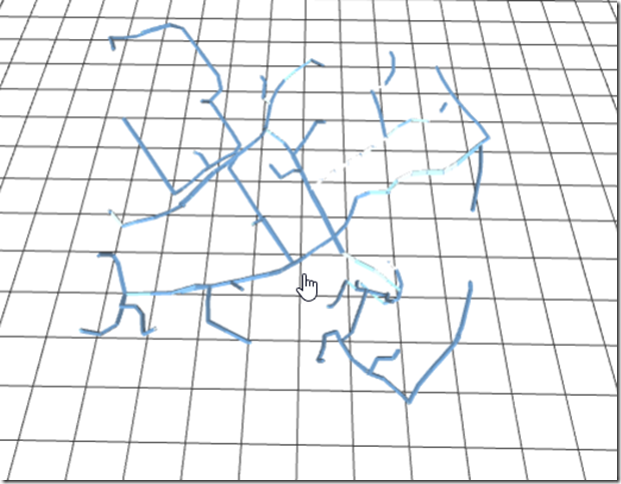
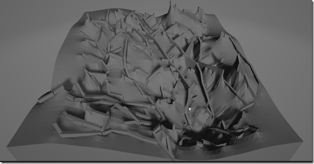
We are in the process of possibly changing residences, so (during my coding fun times on Wednesday mornings with a friend) I revisited this project. When I left it, it looked like this:
In fact, that was so not-cute that I had tried to go 2D with it instead.
I revisited it, and went through several stages.
First, I had to re-do how I called Google Maps – they no longer had a “free” tier that was usable, but they now had a “pay as you go” tier which equated to $5 for 1000 route requests. No problem. But, to keep costs low, I added a cache strategy so I didn’t ask for the same thing twice. (Caveat: I think I forgot to turn off traffic, so different requests at different times were delayed by different amounts).
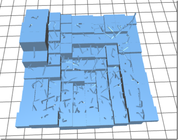
Then, I tried to create a surface underneath the plot. I did this using some electrical engineering stuff I once helped somebody with – Here’s the plot + a surface underneath it. Better, but not the awesome I was hoping:
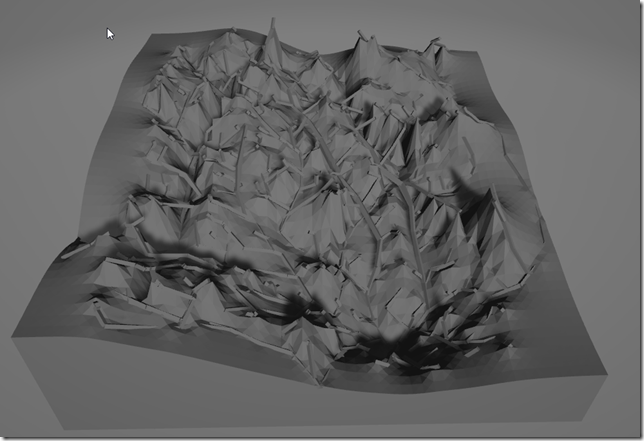
I called that the “Minecraft” look. (That’s a very rough draft with only 10×10, Its about the same at 50×50 except the squares are smaller). I went for something where I calculated the midpoint and drew a polyhedron from each of the four vertices, it looked a lot better:
(The previous were github previews of STL files; this is 3D Model Viewer built in to Windows).
But, its still to .. Jaggedy. So, I did a few things: First, I made it so rather than a spiderweb, I did a “ramp” effect (filling in underneath the path), as well as, I trimmed off all the residential streets (<30mph) at the ends of the routes. This gave me a much better print, which is closer to what I had in mind when I started: something that showed “Which were the best ways to get places”:
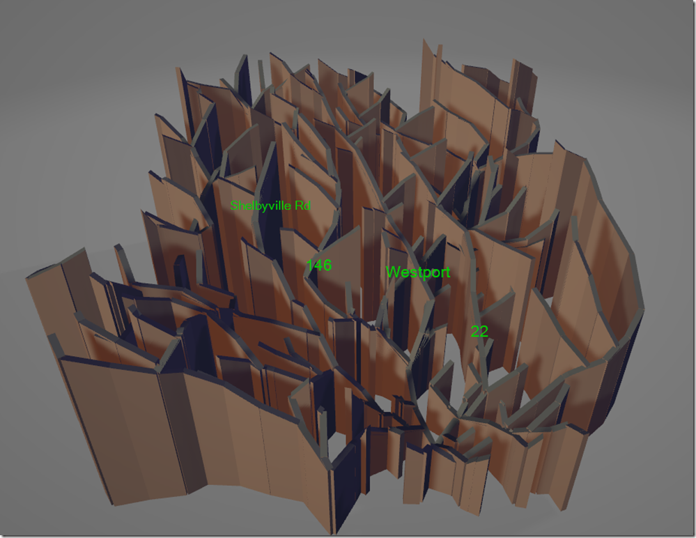
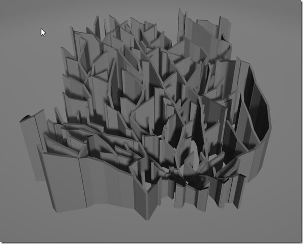
However, I didn’t realize it, but I had done something even better. Here’s Just the Ramps:
This is what I had been going for! To heck with the surface print part! You can see the mountain AND the detail! This is commit a75a67 at https://github.com/sunnywiz/TreeOfDirection/.
Next direction — where I do the same thing for both addresses, and then figure out a way to do stuff in two colors (ie, two prints, but that join together). In order to do this, I have to first force the bounding boxes to be exactly the same.
Also other things learned – 3D slicing has come a long way, I don’t need things to be perfectly combined as long as they don’t have holes in them.
