Switching from iPhone to Android (Samsung S7)

img_20170903_110354_847I wanted to write a nice detailed blog post with pictures and screenshots. Would take too long to get it “Perfect” so I am punting.  (I did write this using the WordPress app on the phone)  ** I continued this from my laptop later.

Here are crib notes instead.

Summary: it’s good, it’s functional. It’s less pretty on the watch side, and MMS is subpar, but better voice recognition, LastPass integration, wireless charging make up for that. I’m going to stick with it for a year.

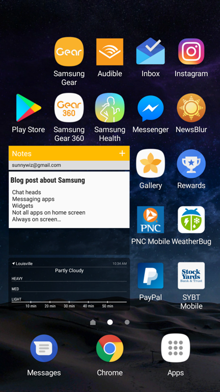
Addendum: it’s frustrating to learn a new ecosystem. And because Android has so many variations it’s hard to know what information applies. For example – getting that screenshot in this post – there is probably a better way but I had to use Google voice to take it, send it to WordPress media library, then include it in this post.   (Addendum to the dum:  Turns out there’s a “swipe left with your palm” gesture for my phone, but I still can’t save the screenshot to my camera roll)

Stuff I like:

  • Chat heads – if I use FB messenger for SMS.  They pop open over any app, and let me continue a conversation without switching apps.
  • Voice recognition is better – especially in the car.  It seems to want to use the phone’s microphone, rather than the 3 second delay switching to bluetooth through the car microphone.
  • Can choose default apps – like which Messenger app to use.    Thank you “Intentions”.
  • Widgets – Not going crazy with this, I only have two or three.
  • Not all apps on home screen – I can leave some in the drawer.  I don’t have to force myself to choose a position for EVERY FRICKING APP, just the ones that matter.
  • Always on screen – specific to my Samsung S7 device?   Shows time, date, next calendar appointment, etc before I hit the power button.   Major phone use case.
  • Number row – by default, turned on, on the keyboard.  Also a swipe keyboard, very nice for one hand use.
  • Better large screen shrinking – for single hand use.  Much more usable than Apple’s double-finger-home-button thing that never worked for me.
  • Last pass for apps – incredibly useful, when I’m in an App, Lastpass can integrate in and provide passwords.
  • Wireless charging – Coworker Steve gave me his old wireless charger.  I’m hooked.  No plugging in.  I bought one for the car, and I need to buy one for home.
  • Workout app has better sharing options – Pretty pictures, square format, straight to instagram, YES.
  • S2 watch can control which notifications go to watch and which dont.
  • Way more watch faces – This is also a curse.  I could not find a decent watch face which had battery, calendar, date, time, and actually worked across my multiple calendars.
  • I can put any icon anywhere on the page – I don’t have to plan from the top.   Thank God.  Clusters are easier to cluster.

What I miss:

  • Miss pretty emoji – I’m used to the iPhone and Slack emoji sets.  I don’t know for sure when I send my wife a kiss-with-eyes-closed emoji that its showing up the same.
  • Hue / OK Google integration misses things – I’ll say turn the lights off, and it will say “I got 18 of them, three not responding”, but only 8 will change.
  • Miss overcast podcast player with it’s auto silence trimming – For this reason alone, I have my de-SIM’ed iPhone living in the car, being an iPod for playing podcasts.
  • Group messaging wierdness interacting with iMessage – I won’t get pictures or video.  My entire family is iOS based, so I’m at a disadvantage.
  • Miss sharing position easily (find my friends) – Wife and I used to use this in passive always-on mode.  i can do Glympse for limited engagements.  I think Google has a solution for this somewhere.
  • Text selection wierd no magnifying glass for fine control – it took me a while, but I finally (with writing this post) got a handle on the text select stuff.  I have to take this back – I prefer the Android one.  I can actually drag the little draggers around, and they snap intelligently.   But I do miss the magnifying glass.
  • Miss square Apple Watch – It was smaller, looked better, and seemed more functional – especially the voice command part.
  • Miss scroll to top.
  • S2 battery life not great.   However, if I turn on Airplane mode (the S2 has its own 3G connection that I haven’t activated), its very comparable – down to 50% at the end of the day.

Btw, the screenshot is my second screen, not my home screen.


Comparing Nutrition Tracking Apps (iOS)

I’ve decided I’m going to track nutrition again.  I tested entering the same day into 4 apps and recorded myself:

Here’s the raw video of all 4 side by side.   Its provided for reference only, I don’t expect you to actually watch it, unless you work for one of the above companies trying to understand what I saw.

[youtube=http://www.youtube.com/watch?v=05zfzKXJlzA&w=448&h=252&hd=1]
4 Apps, Long and Boring


Here’s a close up of just the breakfast bits, for only two apps, trying to compare the same item to the same item:

[youtube=http://www.youtube.com/watch?v=cJ7z_74n_GQ&w=448&h=252&hd=1]
2 Apps, Just Breakfast, Almost Watchable


Frustrations

These are all my opinions, not statements of fact. 

  • Up!
    • Could not find some restaurant food, so I had to go find something else that might or might not be equivalent.
    • Amazingly wrong values for Orange Juice (45 cal per orange!), and Orange Juice (100 cal per g)
    • While the “just add it and edit the quantity later” seems like a good idea at first, I think there were a lot more touches in the end.
      • One reason why this one had a longer video – I had to go look up caloric values for stuff it couldn’t find, so that I could go back into the app and update things to more reasonable values.  The other apps, I already knew the caloric value I was looking for, so they were spared this embarrassment.
    • Their “slider” for changing quantity took a bunch of fiddling.
    • If you enter food as you eat it, it’s a lot easier, but otherwise, selecting times for meals gets hard.  I like the other apps “Breakfast, Lunch, Dinner, Snack” method better. 
  • MyFitnessPal
    • Looked kinda clunky?  (but it worked!)
  • FatSecret
    • I think I was trying to put in 471g of soup, since my scale tells me its 471g, and wow that was annoying to have to scroll gently from 100 to 471.
  • Lose It!
    • Their selection of foods seemed limited, didn’t find what I was looking for.  Its like they’ve tried to reduce complexity of what is available or something?
    • App crashed during data entry, I had to restart it.

Winner

MyFitnessPal gets my “business”.  I do not remember being frustrated trying to enter anything; everything I searched for came up; they had decimal input; and I agreed with the calorie estimates given the first time around.

Nexus 10 vs iPad Retina: Actual Usage

I’ve had the pleasure (and displeasure) of using both an iPad Retina and a Nexus 10 for the last week or two last month and a half.  (this post was started in the last week of December)

This year, the iPad wins.

Nexus Failures:

  • In Facebook, a link to a video sent me to a mobile facebook website; the Nexus crashed and rebooted.   This has happened almost nightly.
  • In Facebook, pictures crop too much.   I couldn’t see the meme text without clicking in to the photograph.
  • In Evernote, linked to a Bluetooth keyboard, trying to organize the list of stuff that I want to get done for the weekend: a total disaster.
    • I could NOT use the arrow keys to navigate through the document.
    • Copy and Paste did not seem to work.
  • In the Trulia app: browsing real estate with the wife… Pictures much larger and UI worked better on the iPad.  I was jealous that she was using the iPad and I was using the Nexus.
  • Schlock Mercenary on was unusable – the UI elements fused together overlapping in a horrible way.
  • Battery on the Nexus seemed to drain faster… Two days to empty instead of four.  Note: This is not a measured, scientific observation.
  • Watching Videos on YouTube:
    • If the video started rebuffering, I could not tell the video to pause for a while (to let it get ahead).  I could only pause when it was buffered and playing.    On the iPad, pausing was independent of rebuffering.
    • I experienced rebuffering when their appears to be data still available in the buffer.
  • Netflix:  About the same, till I went to make a 30-second rewind (to show my wife something awesome).  On the Nexus, it did not register the shuttle change unless I did it for more than a minute.  When you’re trying to show a skeptical loved one something awesome, a minute is a LONG time to wait.  On the iPad, the shuttle resolution was better.

Nexus Successes:

  • Watching YouTube videos was a better experience – mostly due to the form factor, and better contrast.   (I was watching video on both devices – letting one “buffer” up while I watched on the other)

About the same:

  • Kindle Book Reading about the same on both.
    • Visiting a website with Flash – without working around it on the nexus – failed equally on both.  I tried working around it on the Nexus, but I couldn’t get that to work (probably the wrong browser)
  • Reading email via the Gmail app was about the same on both.  Both of them, I wish they fit more data on the screen. 

I dearly wanted the experience to be equal.. I have a soft spot for Android, I love its “intent” system for hooking apps together.. but as an honest consumer, the iPad experience for me in December 2012, January 2013, was better.   And for $100 more.. yes, I’d say it was worth it.

Addendum 2/9/2013:  My wife took over the Nexus for a while.    She is frustrated with it, HOWEVER, having multiple users on the device was clearly a win.     She’s going to get an iPad Mini, it fits her collection of purses better.  (Women are weird) (I like them like that)