Previous posts in the series:
I could barely contain myself. Thurday night, I had all kinds of data.. just calling my name.
GPS Time, Device Time, Longitude, Latitude,GPS Speed(km/h), Horizontal Dilution of Precision, Altitude(m), Bearing, Gravity X(G), Gravity Y(G), Gravity Z(G),Miles Per Gallon(Instant)(mpg),GPS Altitude(m),Speed (GPS)(km/h),Run time since engine start(s),Speed (OBD)(km/h),Miles Per Gallon(Long Term Average)(mpg),Fuel flow rate/minute(cc/min),CO₂ in g/km (Average)(g/km),CO₂ in g/km (Instantaneous)(g/km)
Thu Jan 03 16:29:06 EST 2013,03-Jan-2013 16:29:11.133,-85.57728556666666,38.24568238333333,0.0,16.0,196.9,0.0,-0.015994536,0.9956599,0.0949334,0,196.9,0,17,0,31.66748047,19.45585442,259.47247314,-
Thu Jan 03 16:29:09 EST 2013,03-Jan-2013 16:29:14.004,-85.57729401666667,38.245684716666666,0.0,12.0,195.2,0.0,-0.015994536,0.9956599,0.0949334,0,195.2,0,20,0,31.66731453,45.80973816,259.47247314,-
Friday afternoon, once work things were completed, I started playing with it. To start, I tried to read in the CSV file into Powershell. I figured once I had it there, I could do *something* with it.
I faced some challenges:
- The CSV column names are not “clean”, so I needed to sanitize them
- Some files did not have certain pieces of data.
- CSV import was a string, needed to be casted to a number before certain operations (“137” –gt 80.0 = false)
- The units are fixed, part of the Torque app. (Actually, part of the OBDII standard)
After getting it read in, I looked around for a graphing library. Turns out I can use System.Windows.Forms.DataVisualization with Powershell. (thank you sir), which had some fun stuff:
- FastPoint ignores colors
- Had to turn off auto-scale on the Y-Axis
- Made the charting controll Dock-Fill in the form
I ended up with this script:
$alldata = @();
$files = gci . -r -include "trackLog.csv"
foreach ($file in $files) {
   $lines = get-content $file
   "Processing {0}: {1} lines" -f $file, $lines.count

   # to get around errors with header names not being valid object names
   $lines[0] = $lines[0] -ireplace '[^a-z,]',''

   $data = ($lines | convertfrom-csv)
   $alldata = $alldata + $data
}
"Total of {0} items" -f $alldata.count

$speedmeasure = $alldata | measure-object GpsSpeedKmh -min -max
$speedspread = $speedmeasure.Maximum - $speedmeasure.Minimum
if ($speedspread -le 1.0) { $speedspread = 1.0 }

$mpgmeasure = $alldata | measure-object MilesPerGallonInstantmpg -min -max
$mpgspread = $mpgmeasure.Maximum - $mpgmeasure.Minimum
if ($mpgspread -le 1.0) { $mpgspread = 1.0 }

$ffmeasure = $alldata | where-object { $_.Fuelflowrateminuteccmin -ne "-" } | measure-object Fuelflowrateminuteccmin -min -max
$ffspread = $ffmeasure.Maximum - $ffmeasure.Minimum
if ($ffspread -le 1.0) { $ffspread = 1.0 }

[void][Reflection.Assembly]::LoadWithPartialName("System.Windows.Forms.DataVisualization")
$chart = new-object System.Windows.Forms.DataVisualization.Charting.Chart
$chart.width = 800
$chart.Height = 600
$chart.Left = 40
$chart.top = 30
$chart.Name = "Foo"

$chartarea = new-object system.windows.forms.datavisualization.charting.chartarea
$chart.ChartAreas.Add($chartarea)

$legend = New-Object system.Windows.Forms.DataVisualization.Charting.Legend
$chart.Legends.Add($legend)

$series = $chart.Series.Add("Series1")
$series = $chart.Series["Series1"]
#FastPoint ignores color
$series.ChartType = [System.Windows.Forms.DataVisualization.Charting.SeriesChartType]::Point
$series.IsXValueIndexed = $false

foreach ($data in $alldata)
{
    if ($data.MilesPerGallonInstantMpg -eq $null) { continue }
    if ($data.Fuelflowrateminuteccmin -eq $null) { continue }
    if ($data.Fuelflowrateminuteccmin -eq "-") { continue }

    $speed = (([double]$data.GpsSpeedkmh              - $speedmeasure.Minimum) / $speedspread)
    $mpg =   (([double]$data.MilesPerGallonInstantMpg -    $mpgspread.Minimum) /   $mpgspread)
    $ff    = (([double]$data.Fuelflowrateminuteccmin  -    $ffmeasure.Minimum) /    $ffspread)

    $higherspeed = $speed;
    if ($higherspeed -gt 0.05) { $higherspeed = [Math]::Sqrt($speed) }
    $lowerspeed = $speed * $speed;

    # MPG numbers seem to be clustered closer to 0 with a few annoying outlyers. spread them up a bit.
    #if ($mpg -gt 0.05) { $mpg = [Math]::Sqrt($mpg) }

    # calculate color.
    $blue = 250*$ff;

    # slower = more red
    # faster = more green
    # medium = yELLOW!
    $red = 250 - (250 * $lowerspeed)
    $green = 250 * $higherspeed

    $datapoint = New-Object System.Windows.Forms.DataVisualization.Charting.DataPoint($data.Longitude, $data.Latitude)
    $color = [System.Drawing.Color]::FromARgb(125,$red, $green, $blue)

    $datapoint.Color = $color
    $series.Points.Add($datapoint)
    $datapoint.MarkerSize = ($mpg)*5 + 1
}

$chartarea.AxisY.IsStartedFromZero=$false

$Form = New-Object Windows.Forms.Form
$Form.Text = "PowerShell Chart"
$Form.Width = 1100
$Form.Height = 600
$Form.controls.add($Chart)
$Chart.Dock = "Fill"
$Form.Add_Shown({$Form.Activate()})
$Form.ShowDialog()
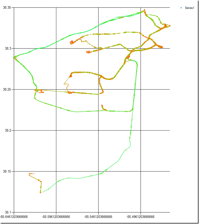
Which reads everything in, scrubs some data, figures some transforms, and yields me the following pretty picture:

- Green = faster, Red = slower.
- Blue = Gas used (doesn’t show very well)
- Fatter = Better MPG (I should reverse this, probably)
- The green lines are the interstates (I71, I264, I64, and I265 shown)
- Stop lights show up as little red dots.
- I had to hand-scale the window till it looked right. Real co-ordinate systems some other day.
I would like to do this in 3-D, but I haven’t gotten my Processing chops quite figured out yet. Maybe next week!


